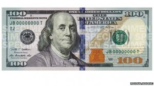
 The new $100 bill goes into circulation Tuesday, adding a splash of color and stylish flourishes to the currency featuring Benjamin Franklin’s ever-familiar face. While Ben’s “You lookin’ at me?” portrait stays the same, there are several notable changes.
1. The very feel of the bill. For the first time, the engraving process includes the effect of “raised printing.” This effect “can be felt throughout the $100 note, and gives genuine U.S. currency its distinctive texture,” a government website on the design changes says.
2. The dashed blue strip to Ben’s left? Not a printing goof. It’s actually part of a security feature designed to help tell real $100s from fake ones. Tilt the bill, and designs along the strip change from bells — as in, Liberty Bells — to the number “100,” in moving patterns. In fact, the blue ribbon has nothing to do with printing — it’s actually woven onto to the paper.
3. Further to Ben’s left (your right) is a new icon rendered in another non-green hue, a copper-colored inkwell. Within the inkwell is another security feature, a color-shifting bell.
4. Around the inkwell (not in it) is a quill. It represents the pen used by the Founding Fathers to sign the Declaration of Independence, according to newmoney.gov, a website affiliated with the Federal Reserve Board, U.S. Secret Service and the Treasury Department.
5. By the inkwell is a “100” label, in the bill’s lower right corner. Its color alternates between copper and green when you tilt the bill — another new security feature.
6. The ghostly watermark of Franklin’s face, visible on the right side of the bill when you hold it up to a light, is still there. But the portrait is simplified for the new bill.
USA Today

Leave a Reply
You must be logged in to post a comment.